skip to main |
skip to sidebar
MOBY-DICK, Page 176
Title:
The rest of his body was so streaked, and spotted, and marbled with the same shrouded hue, that, in the end, he had gained his distinctive appellation of the White Whale; a name, indeed, literally justified by his vivid aspect, when seen gliding at high noon through a dark blue sea, leaving a milky-way wake of creamy foam, all spangled with golden gleamings.10 inches by 6 inches
ink on found paper
February 27, 2010
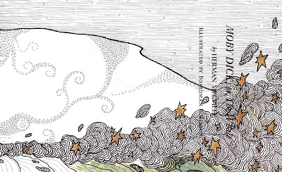


A couple of things I wanted to mention about this piece. First, the "golden gleamings" are actually a metallic gold ink. It doesn't show well in the scan, but it looks quite beautiful in reality. Second, this is the title page from an old edition of "Moby-Dick" and the green noticeable near the bottom is actually water damage and staining from the green boards of the book. I thought that the idea of drawing the whale Moby-Dick on a piece of paper that was badly water damaged was simply too perfect to pass up.
ReplyDeleteI agree! Another one of your best, in my opinion. Beautiful lines and textures.
ReplyDeleteLove the delicacy of this one
ReplyDeleteElizabeth, thank you very much. If only I had the time I would make every illustration a finely detailed pen and ink piece.
ReplyDeleteJeffrey, I was thinking quite a bit about the linework of early 20th century illustrators like Willy Pogany, Arthur Rackham, and to a degree Harry Clarke, Edmund Dulac and Kay Nielsen. Trying to reproduce some of that feel with the linework and the gold ink. I'm really pleased with how this turned out.
ReplyDeleteAll those guys are fantastic. Rackham especially just humbles me into never picking up a pen again, he draws so well. I sure would like to see some of his work in person.
ReplyDeleteYour piece here actually brought Edward Gorey to mind as well.
Jeffrey, I had not thought of the Edward Gorey comparison but he too is a favorite of mine and looking closer I can see the influence as well. Gorey makes it seem so effortless with his scratchy inky lines. That kind of loose line is something I've never been able to master much less even be successful with it. I seem to have a tyrant in my hand that demands almost every line be precise, regular, close and definitive.
ReplyDeleteYour comment about Rackham's art was intriguing because my wife and I were discussing something very similar 2 days ago. We've all seen reproductions, or rather reproductions of reproductions, of the illustrations or Rackham and Nielsen and so on, but who has been fortunate enough to see the originals? What did Rackham's watercolor pieces really look like, since the end result was almost surely intended solely for the printed page? Were there shortcuts or compromises made for eventual printing and publication or does his art look as delicately gorgeous in its original form as it does between the boards of a book?